
Perlic Script
Intagram Posts:


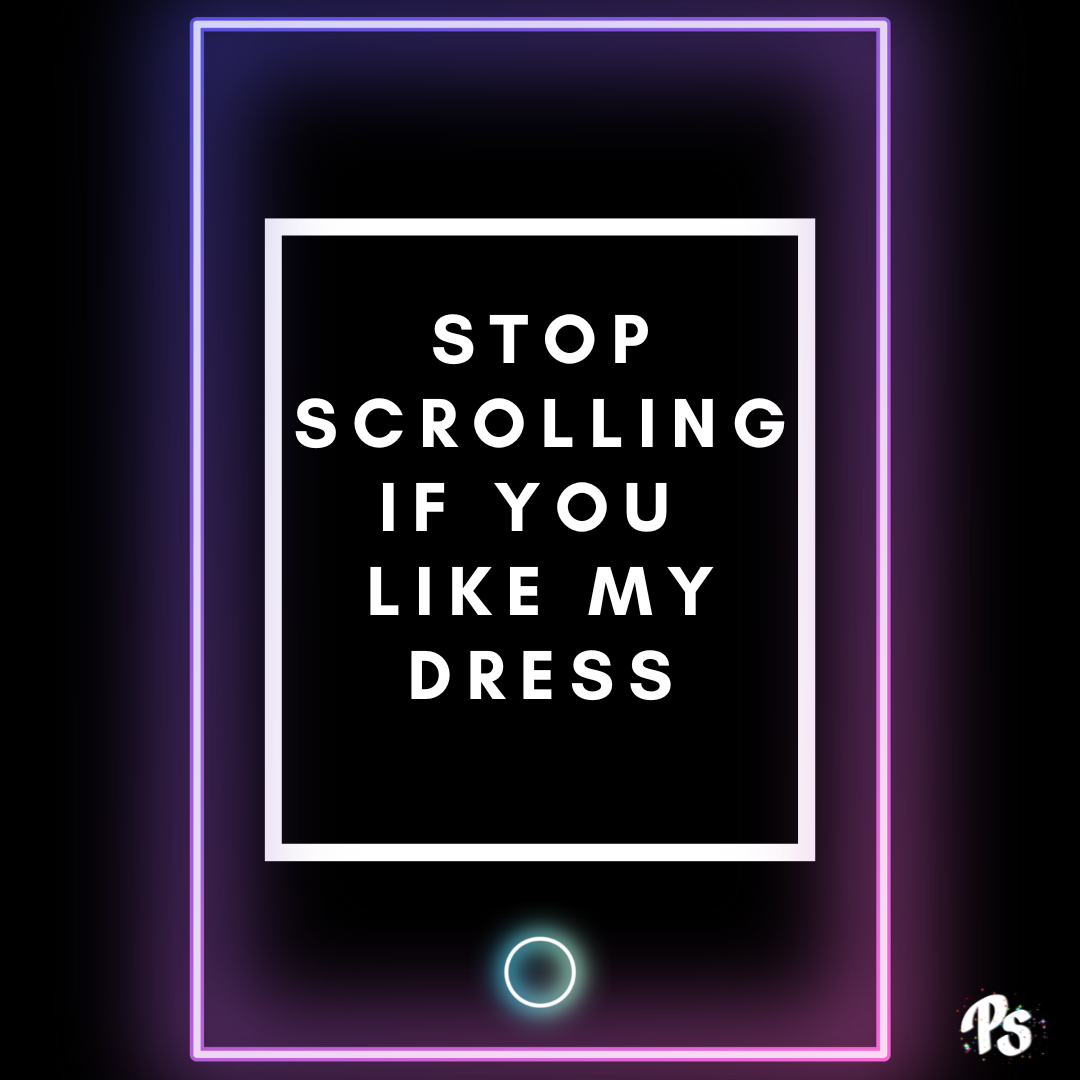
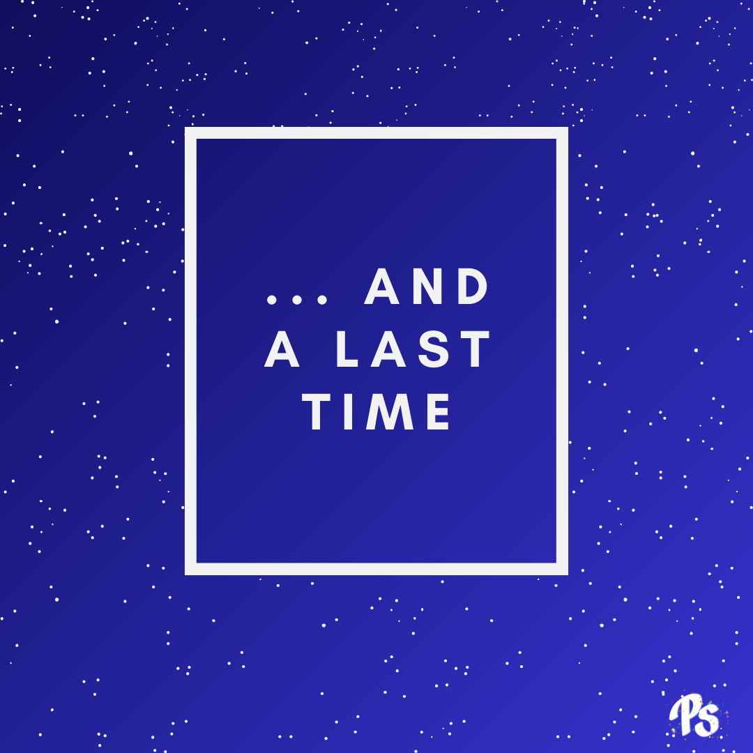
Instagram Posts created for my brand @perlic_script. All posts follow a similar format, a 1:1 square with a rectangle aligned slightly towards the top of the page, title in capitals in the centre, and a bottom-right logo.
The bottom right logo is either in black or white depending on the poem. The logo was designed on commission by artist Lauren Murray.
Each poem is given its own visual identity, with images edited by myself or photographs I have taken.
Previous poems also receive a “revamp” of sorts, where their graphics have been edited to suit the current style. This is the case with the poems ‘Where Me Come From’ and ‘Hell is Empty’ pictured below.
I often take advantage of bold colours, giving each poem a colour it is associated such as the blues of ‘My Lake’ and ‘…And a Last Time’ and the purple of ‘Stop Scrolling if you Like my Dress.’

Intagram Reels:

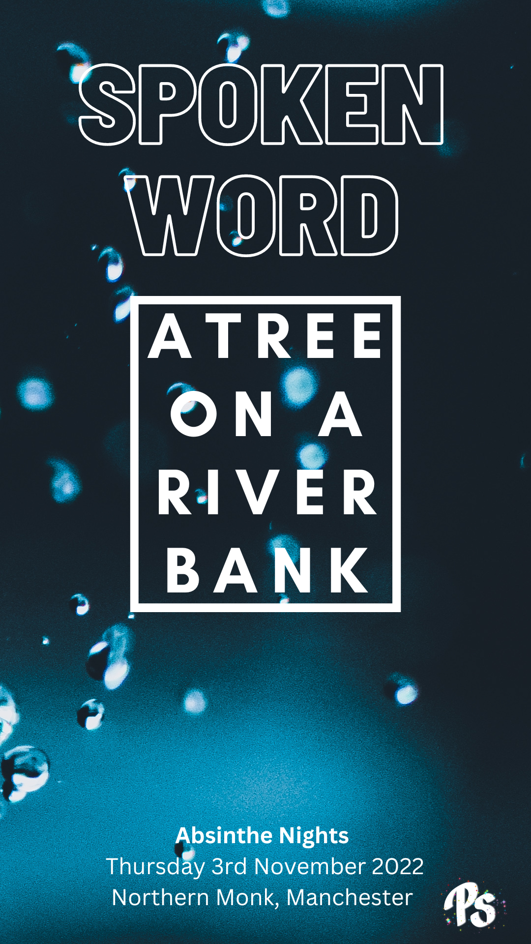


When posting videos, I create cover images reminiscent of the 1:1 square image I use for the primary post that shows the poem text. The image is elongated to fill the screen on a reel, and the cover art is, in cases, extended to fill the page as well. Each piece of cover art allows each poem to maintain its visual identity and strongly connects the two posts together.


